The critical drivers for gold are pointing in the same direction.
Roll your mouse over each cause and effect to reveal more detailed information.
 Trend example chart from StockCharts.com")
 Trend example chart from StockCharts.com")
 Trend example chart from StockCharts.com")
![[Emc]](http://stockcharts.com/images/minilink_sc.gif) , there was a large price change over a long period of time. While there were not any false breaks below the uptrend line on the arithmetic scale, the rate of ascent appears smoother on the semi-log scale. EMC doubled three times in less than two years. On the semi-log scale, the trend line fits all the way up. On the arithmetic scale, three different trend lines were required to keep pace with the advance.
, there was a large price change over a long period of time. While there were not any false breaks below the uptrend line on the arithmetic scale, the rate of ascent appears smoother on the semi-log scale. EMC doubled three times in less than two years. On the semi-log scale, the trend line fits all the way up. On the arithmetic scale, three different trend lines were required to keep pace with the advance. Trend example chart from StockCharts.com") , there were two false breaks above the downtrend line as the stock declined during 2000 and 2001. These false break outs could have led to premature buying as the stock continued to decline after each one. The stock lost 60% of its value three times over a two year period. The semi-log scale reflects the percentage loss evenly, and the downtrend line was never broken.
, there were two false breaks above the downtrend line as the stock declined during 2000 and 2001. These false break outs could have led to premature buying as the stock continued to decline after each one. The stock lost 60% of its value three times over a two year period. The semi-log scale reflects the percentage loss evenly, and the downtrend line was never broken. Trend example chart from StockCharts.com") shows an uptrend line that has been touched 4 times. After the third touch in Nov-99, the trend line was considered a valid line of support. Now that the stock has bounced off of this level a fourth time, the soundness of the support level is enhanced even more. As long as the stock remains above the trend line (support), the trend will remain in control of the bulls. A break below would signal that net-supply was increasing and that a change in trend could be imminent.
shows an uptrend line that has been touched 4 times. After the third touch in Nov-99, the trend line was considered a valid line of support. Now that the stock has bounced off of this level a fourth time, the soundness of the support level is enhanced even more. As long as the stock remains above the trend line (support), the trend will remain in control of the bulls. A break below would signal that net-supply was increasing and that a change in trend could be imminent. Trend example chart from StockCharts.com") example, the second high point appears to be too close to the first high point for a valid trend line; however, it would be feasible to draw a trend line beginning at point 2 and extending down to the February reaction high.
example, the second high point appears to be too close to the first high point for a valid trend line; however, it would be feasible to draw a trend line beginning at point 2 and extending down to the February reaction high. Trend example chart from StockCharts.com") was touched four times over a 5-month period. The spacing between the points appears OK, but the steepness of the trend line is unsustainable, and the price is more likely than not to drop below the trend line. However, trying to time this drop or make a play after the trend line is broken is a difficult task. The amount of data displayed and the size of the chart can also affect the angle of a trend line. Short and wide charts are less likely to have steep trend lines than long and narrow charts. Keep that in mind when assessing the validity and sustainability of a trend line.
was touched four times over a 5-month period. The spacing between the points appears OK, but the steepness of the trend line is unsustainable, and the price is more likely than not to drop below the trend line. However, trying to time this drop or make a play after the trend line is broken is a difficult task. The amount of data displayed and the size of the chart can also affect the angle of a trend line. Short and wide charts are less likely to have steep trend lines than long and narrow charts. Keep that in mind when assessing the validity and sustainability of a trend line. Trend example chart from StockCharts.com") extends up from the end of 1994, and passes through low points in Jul-96, Sept-98 and Oct-98. These lows were formed with selling climaxes, and represented extreme price movements that protrude beneath the trend line. By drawing the trend line through the lows, the line appears to be at a reasonable angle, and the other lows match up extremely well.
extends up from the end of 1994, and passes through low points in Jul-96, Sept-98 and Oct-98. These lows were formed with selling climaxes, and represented extreme price movements that protrude beneath the trend line. By drawing the trend line through the lows, the line appears to be at a reasonable angle, and the other lows match up extremely well. Trend example chart from StockCharts.com") chart shows an internal trend line that is formed by ignoring price spikes and using the price clusters, instead. In October and November 1998, Coke formed a peak, with the November peak just higher than the October peak (1). If the November peak had been used to draw a trend line, then the slope would have been more negative, and there would have appeared to be a breakout in Dec-98 (gray line). However, this would have only been a two-point trend line, because the May-June highs are too close together (black arrows). Once the Dec-99 peak formed (green arrow), it would have been possible to draw an internal trend line based on the price clusters around the Oct/Nov-98 and the Dec-99 peaks (blue line). This trend line is based on three solid touches, and it accurately forecasts resistance in Jan-00 (blue arrow).
chart shows an internal trend line that is formed by ignoring price spikes and using the price clusters, instead. In October and November 1998, Coke formed a peak, with the November peak just higher than the October peak (1). If the November peak had been used to draw a trend line, then the slope would have been more negative, and there would have appeared to be a breakout in Dec-98 (gray line). However, this would have only been a two-point trend line, because the May-June highs are too close together (black arrows). Once the Dec-99 peak formed (green arrow), it would have been possible to draw an internal trend line based on the price clusters around the Oct/Nov-98 and the Dec-99 peaks (blue line). This trend line is based on three solid touches, and it accurately forecasts resistance in Jan-00 (blue arrow). Trend example chart from StockCharts.com") was touched 4 times, and seemed to be a valid support level. Even though the trend line was broken in Jan-00, the previous reaction low held, and did not confirm the trend line break. In addition, the stock recorded a new higher high prior to the trend line break.
was touched 4 times, and seemed to be a valid support level. Even though the trend line was broken in Jan-00, the previous reaction low held, and did not confirm the trend line break. In addition, the stock recorded a new higher high prior to the trend line break.


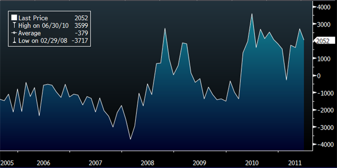
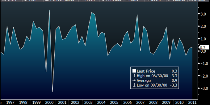
EVENT | ACT | EXP | PREV |
Trade Balance (JUN) | 2052M | 2200M | 2699M |
Retail Sales SA (MoM) (JUN) | -0.1% | 0.4% | -0.6% |
Retail Sales ex Inflation (QoQ) (Q2) | 0.3% | 0.4% | 0.2% |